A year working with HTML Web Components
November 27, 2023 – @hawkticehurst
While the term “HTML Web Components” is fresh out of the oven, the architecture it refers to has been sitting on the counter at room temperature for a while now. I’ve been experimenting with this way of building web components for almost a year, and in this post, I want to talk about some of the big takeaways I’ve come to thus far.
“Regular” web components
As an increasing number of people already know, “web components” is a loose term that refers to a set of evolving browser APIs that allow you to create custom HTML elements. You can think of web components as a browser-native way of building reusable UI.
There are three primary APIs that are commonly used together to build “web components”:
- Custom Elements: A JavaScript API for creating custom HTML elements
- Shadow DOM: A JavaScript API that is primarily used for creating scoped styles and component slots (i.e. rendering children within a component template)
- HTML Templates: An HTML element (and associated JavaScript API) that typically acts as a way to define the template markup of a web component
For the first decade-ish of their inception and usage, web components have been predominantly marketed, documented, and used in a way that mirrors single-page application (SPA) component models, popularized by frameworks like React, Svelte, and Vue.
Web component APIs, just like SPA component APIs, use JavaScript to encapsulate bits of markup, style, and behavior to represent and dynamically render distinct pieces of UI at runtime. In the same way you can build a React component and access it via a custom JSX tag (i.e. <CounterButton />) you can do the same with web component APIs and access it via a custom HTML tag (i.e. <counter-button>).
This model has worked quite well, but it is not without its paper cuts. You might have heard about a lot of them at this point, but to call out a few big ones, “regular” web components…
- Are unable to be server-side rendered (SSR)*
- Have inflexible styling rules when using Shadow DOM
- Currently have incomplete support for full accessibility and ARIA semantics when using Shadow DOM
*The Declarative Shadow DOM API will change this but it does not yet have full browser support at the time of writing.
For me (and others), these paper cuts added up. During the last year, there has been an increasing level of experimentation with a different method of building web components.
HTML web components
In 2022, projects like Eleventy’s WebC and Enhance started pioneering a web component architecture that focused exclusively on using the custom elements API, and nothing else from the “web component” bucket of APIs. Fast-forward a year, this method of building web components has been pushed forward and finally has a name.
The core premise of HTML web components is to write HTML as you would normally and then “enhance” it by wrapping the parts you want to be interactive using a custom element tag.
For example, if you wanted to define the markup for a counter button it would look like this:
<!-- HTML web component -->
<counter-button>
	<button>Count is <span>0</span></button>
</counter-button>

<!-- Regular web component (for comparison) -->
<counter-button></counter-button>
Rather than dynamically generating the component UI at runtime using JavaScript like you would with regular web components, the HTML web component is parsed, rendered, and styled as normal HTML. That HTML will then be seamlessly hydrated once the JavaScript associated with the custom element tag is executed.
It also addresses all the earlier mentioned paper cuts:
- Component markup is fully SSR-able
- Component markup can now be styled like regular HTML
- Common accessibility practices can be applied without issue
With that light context setting complete, below are some insights, takeaways, and general musings from a year of working with this architecture.
HTML web components are islands
I often like to casually describe this way of building web components as “wrapping HTML with custom elements to declaratively define interactive UI.” The custom element tag acts as a sort of box of interactivity –– any HTML you put inside of that box can be made interactive using the powerful lifecycle methods and functionality that the custom element API provides.
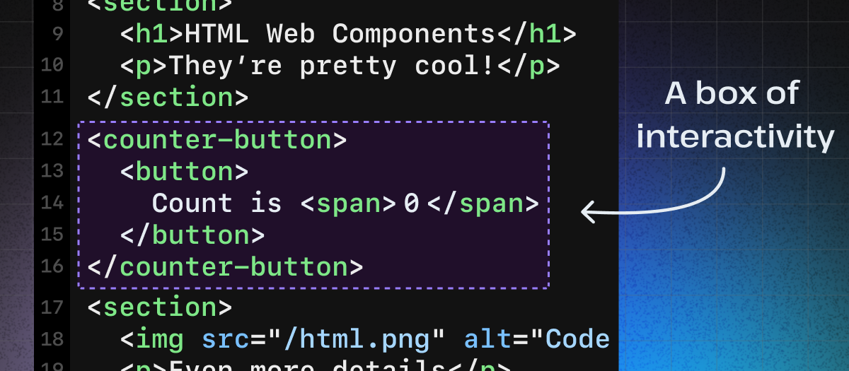
This description/mental model might sound familiar to some — it certainly was for me — these are islands!
Realizing that HTML web components (and custom elements at large) can be thought of as “islands” as described in the islands architecture, really made things click for me early on. As the analogy goes, in a sea of static HTML, a custom element/HTML web component denotes an island of interactivity.
Fun fact: Custom elements are so good at being islands it’s how Astro implemented their islands architecture.
Progressive enhancement is a piece of cake
HTML web components are one of the best tools I’ve come across for adhering to the design philosophy of progressive enhancement. My favorite feature of custom elements, in particular, enables a method of styling that wonderfully supports the goal of adhering to progressive enhancement: the :defined pseudo-class.
With this pseudo-class, you can declare styles for when a custom element has not yet been hydrated. You’ll commonly see this demonstrated by simply hiding a custom element until it has been defined using the customElements.define() method.
counter-button:not(:defined) {
	display: none;
}
counter-button:defined {
	display: block;
}
But this can lead to layout shift issues if not carefully accounted for. Plus on top of that.. this is CSS! You can push it so much further. Perhaps, we could add disabled styling to the button when it hasn’t been hydrated (note: you should also probably add the disabled attribute by default too and remove it once JS executes).
counter-button:not(:defined) button {
	cursor: not-allowed;
	background: grey;
}
counter-button:defined button {
	cursor: pointer;
	background: white;
}
Maybe you like fancy component skeletons with animated shimmers.. easy.
/* Some default button styles */
counter-button button {
	background-color: #dfdfdf;
	border: none;
	border-radius: 6px;
	padding: 8px 20px;
}
/* Skeleton/shimmer styles applied before JavaScript has loaded */
counter-button:not(:defined) button {
	color: rgba(0, 0, 0, 0); /* Hide button text */
	display: inline-block;
	-webkit-mask: linear-gradient(
			-70deg,
			rgba(0, 0, 0) 30%,
			rgba(0, 0, 0, 0.3),
			rgba(0, 0, 0) 70%
		) right/300% 100%;
	background-repeat: no-repeat;
	animation: shimmer 3s infinite;
}
@keyframes shimmer {
	100% {
		-webkit-mask-position: left;
	}
}
/* Button styles applied after JavaScript has loaded */
counter-button:defined button {
	color: #000000;
}
The options are only limited by what you can come up with using CSS. The point is that with :defined you have a trivial browser-native way of declaring pre-JavaScript and post-JavaScript styles on your components. It’s an amazing tool for the progressive-enhancement-conscious developer.
HTML web components are not a silver bullet
Like all things, there are some notable trade-offs when using HTML web components compared to regular web components.
For one, component markup must be copied/repeated anywhere you want to use the component. That is to say, you lose out on the reusable “component-ness” of a regular web component. This is not ergonomic, especially with component templates that have more complex markup.
<!-- HTML web component markup... -->
<counter-button>
	<button>Count is <span>0</span></button>
</counter-button>

<!-- ...must be repeated... -->
<counter-button>
	<button>Count is <span>0</span></button>
</counter-button>

<!-- ...every time they are used... -->
<counter-button>
	<button>Count is <span>0</span></button>
</counter-button>
Additionally, by forgoing shadow DOM, you lose out on native-scoped styling. You can still achieve a sort of pseudo-component-scoped styling by prepending the name of your custom element to all CSS styles, but this can get a bit cumbersome to repeat in my experience.
/* This is kind of like scoped styling.. right? */
counter-button button {
	font: inherit;
	border: none;
	border-radius: 6px;
}
Without shadow DOM you also have no ability to natively add component slots (i.e. render children within a component template).
The good news is that if you’re willing to look outside of native browser APIs and to the land of web frameworks (which I’d wager most people are) these are solved problems!
Projects like WebC and Enhance implemented their own version of component templating, scoped styling, and component slots. In my case, however, I’ve landed on Astro as my preferred pairing with HTML web components.
Astro and HTML web components
I could spend an entire post gushing about Astro, but to give a brief intro for those less familiar: Astro is a web framework that started as a static site generator and has expanded to support the whole gamut of web architectures and use cases. In 2023, they have:
- Static, server, and hybrid rendering modes
- A simple templating syntax and component model (we’ll come back to this later)
- Scoped component styles
- An extensive plug-in ecosystem
- Built-in markdown and MDX support
- File system-based routing
- A built-in
<Image />component - Built-in internationalization features
- Custom API endpoint support
- Custom middleware support
- A built-in, lightweight, type-safe content management system (CMS)
- And on.. and on..
On top of that, they also have, without a doubt, the best documentation on earth right now. If you haven’t given Astro a try yet I can’t recommend it enough.
So where do HTML web components fit into this picture? They pair perfectly with Astro’s component model.
The Astro component model
Astro components “are HTML-only templating components with no client-side runtime.” All they can do is send static HTML, CSS, and JavaScript (that will be executed at a global page level) to the browser.
The anatomy of an Astro component is delightfully simple:
---
// Component script (JavaScript)
// This will be executed at build time or on-demand (i.e. on the server)
const greeting = 'world';
---

<!-- Component template (HTML) -->
<p>Hello {greeting}</p>

<style>
	/* Component styles (CSS) -- scoped by default */
	p {
		color: blue;
	}
</style>

<script>
	// Client script (JavaScript)
	// This will be sent to and executed on the browser
	console.log('Hello from the browser');
</script>
With Astro components, we have all the makings to solve the issues with HTML web components.
- A component model and templating syntax
- Scoped styling
- Even a
<slot />element
Putting it all together, a simple hello world component that will render a greeting based on the value of a text field might look like this:
---
// Components can start with an initial server rendered value
const initialName = 'world';
---

<!--
Astro template syntax will compile this into static HTML
before sending it to the client
-->
<hello-world>
	<input type="text" value={initialName} />
	<p>Hello <span>{initialName}</span>!</p>
</hello-world>

<script>
	// HTML web component code that will execute in the browser
	class HelloWorld extends HTMLElement {
		constructor() {
			super();
		}
		// Lifecycle method that runs when the custom element
		// is connected to the DOM
		connectedCallback() {
			this.input = this.querySelector('input');
			this.span = this.querySelector('span');
			this.input.addEventListener('input', this.updateName);
		}
		updateName = (e) => {
			const val = e.target.value;
			this.span.textContent = val;
		};
	}
	customElements.define('hello-world', HelloWorld);
</script>

<style>
	/* Styles will be automatically scoped to the component! */
	input {
		font: inherit;
		border: none;
		border-radius: 4px;
	}
	span {
		font-style: italic;
	}
</style>
HTML web components make Astro better too
On the flip side, HTML web components solve my biggest issue with Astro components — the fact they don’t have a client-side runtime!
Typically if you need interactive UI in Astro you either need to write vanilla JavaScript (fine for small scripts but can get unwieldy fast) or you can take advantage of the fact that Astro can render other UI framework components like React, Svelte, Vue, etc.
Rendering other component models is a really cool feature but I don’t like that it requires that I need to juggle multiple different syntaxes, framework conventions, and so on while developing. I’d much prefer a model that lets me stay within the boundaries of Astro’s syntax and conventions. HTML web components enable this reality.
To give credit where it’s due, Astro has actually (for a very long time) documented this method of combining Astro components with custom elements. These docs are another place where I initially found inspiration to try out the concept of HTML web components.
Finally, a really exciting premise I’ll leave you with is that when all of this is further combined with the new View Transitions API you have the makings for Astro to become a compelling SPA framework as well. There’s so much more to talk about here, but that will need to be left for a future post/video.
A “proper” example
One of my first “proper” HTML web components used Astro to build an audio player to build a website to host my late father’s music.
Like the examples above, this AudioPlayer component (along with a supporting SongList component) is a custom element that wraps around an <audio> element and some other bits of HTML to build out the rest of the UI. This is then enhanced by a fair bit of JavaScript and CSS.
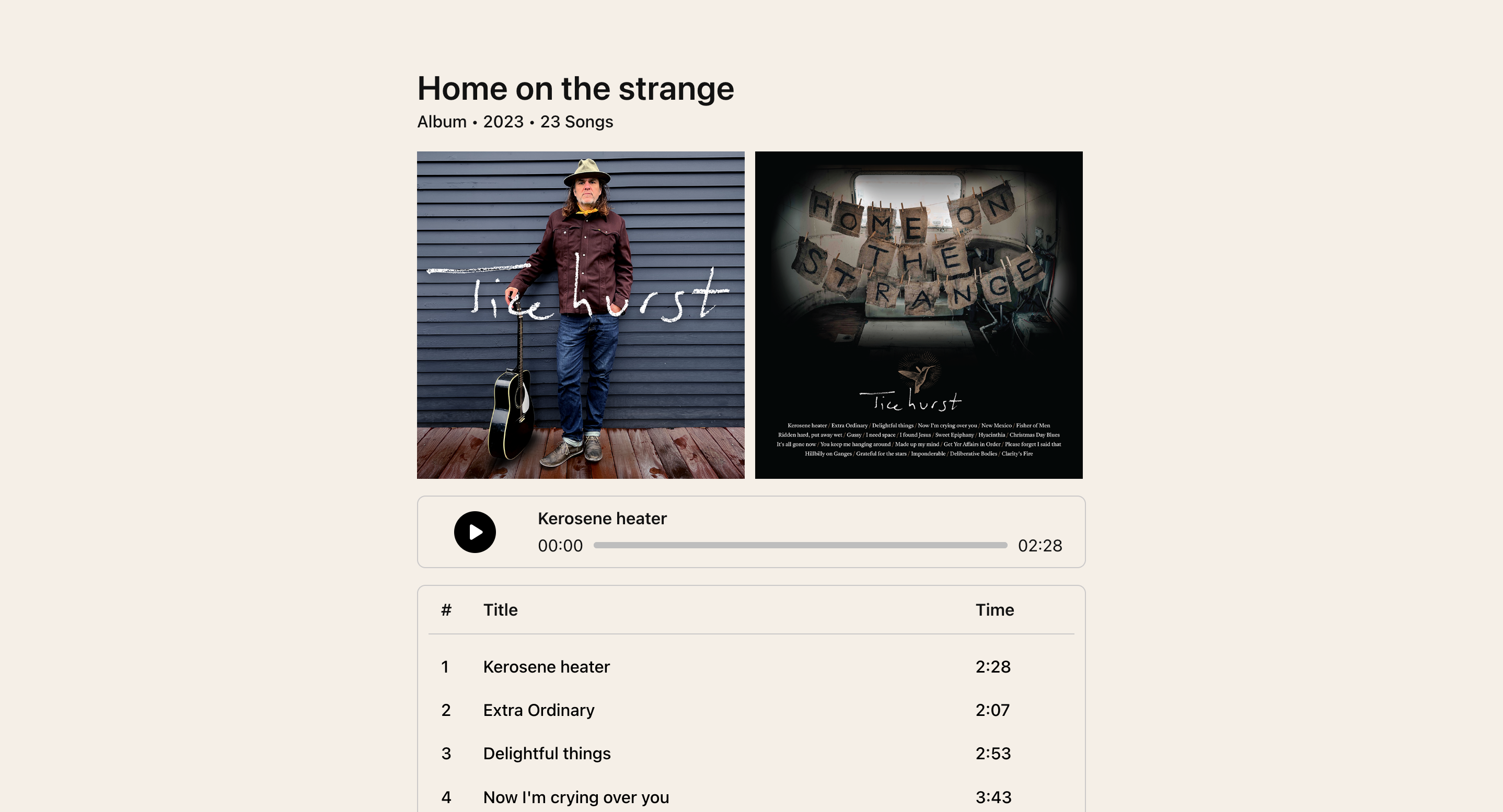
And here’s the thing, without getting into the details further, it just worked.
Of course, there were the usual development hiccups (like how the heck does the HTML audio element API work?!), but as a method of building reusable interactive UI, Astro and HTML web components have come to be my favorite during the last year. In my experience, it’s effectively no different than any of the other major component models.
With one big exception…
The ergonomics could still be improved
After a handful of months building with Astro and HTML web components, I continued to discover more paper cuts, specifically regarding the verbosity of the custom elements API.
To be clear I don’t fault the custom elements API for being low-level and verbose, it needs to be. But as a day-to-day API for developing UI, it’s not my favorite. I went looking for a framework that could provide the terseness and functionality of something like Lit, but that catered to an HTML web components architecture.
Unfortunately, WebC and Enhance don’t fit the bill because they don’t integrate well/at all with Astro components and I never found anything else that checked the specific boxes I was looking for, so a few months ago I decided to build my own.
Say hello to Stellar

Stellar is a tiny framework that improves the ergonomics of building HTML web components.
This is achieved by providing a handful of custom attributes called “directives” that implement event handling and a reactivity model. With Stellar, building a working counter button looks like this:
<counter-button>
	<button @click="increment">Count is <span $state="count">0</span></button>
</counter-button>

<script type="module">
	import { Stellar } from 'stellar-element';
	class CounterButton extends Stellar {
		increment = () => this.count++;
	}
	customElements.define('counter-button', CounterButton);
</script>
There’s much more to read in the docs, but I do want to quickly address a question (and associated cool feature of Stellar) that some may have after a close look at the above syntax: how/where is count initialized?
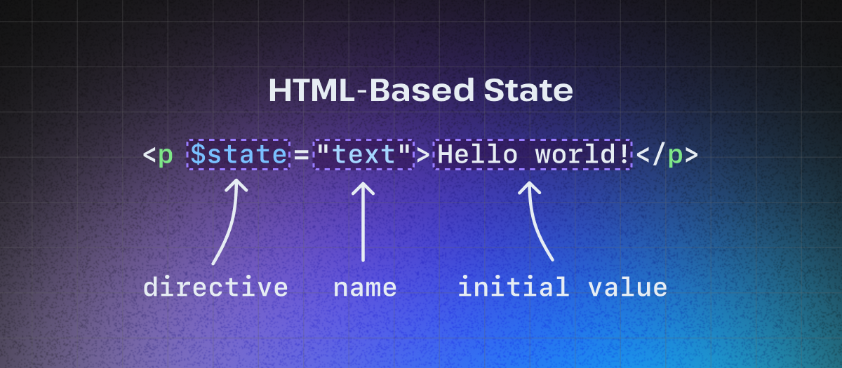
To answer that I have to introduce a concept I’ve come to call “HTML-based state.”
HTML-based state
Stellar, like many other web frameworks, ships a reactivity model that lets you declaratively define pieces of stateful UI.
Unlike other web frameworks, however, state is defined a little differently than what you might have experienced when using tools like React, Svelte, or Vue. In most frameworks, state is defined in JavaScript and then passed into component markup using some type of templating syntax. In Stellar, this relationship is inversed. Reactive state is defined in HTML and then made accessible for manipulation in JavaScript.
In practice, this means a handful of custom attributes called “directives” that begin with a $ can be declaratively added to elements within a Stellar component to access the reactivity model.
For example, the $state directive allows you to define a piece of reactive state based on the existing text content of a stateful element.
When trying to understand a reactive state declaration, the following code…
<p $state="text">Hello world!</p>…should be interpreted in the following way:
- The paragraph element is marked as stateful via the
$statedirective - The name of the state is
textand can be accessed in JavaScript by callingthis.text - The initial value of the state is the string “Hello world!”
Note: As a convenience, all reactive state is coerced to the correct data type when being accessed in JavaScript. For example, when accessing the count state from above it will be of type number.
State should start on the server
An intentional goal of this model is to be extremely SSR-friendly and align (mostly) well with hypermedia-driven principles. While the above examples demonstrate handwriting state directly inside HTML elements, the real use case and goal is to declare initial state in your server and pass the state into Stellar components using the templating language of your server framework.
When used in a framework like Astro, initial component state can start in the server, be encoded directly into your HTML, and then be seamlessly hydrated on the client without any layout shift issues or flashes of new content once JavaScript is parsed and executed.
---
// State starts in the server!
const initial = 'Hello world!';
const count = 0;
---

<hydrate-server-state>
	<p $state="text">{initial}</p>
	<button @click="increment">
		Count is: <span $state="count">{count}</span>
	</button>
</hydrate-server-state>

<script>
	import { Stellar } from 'stellar-element';
	class HydrateServerState extends Stellar {
		constructor() {
			super();
			console.log(this.text); // Logs "Hello world!"
			this.text = 'Hey there!'; // Update paragraph element with text "Hey there!"
			console.log(this.text); // Logs "Hey there!"
		}
		// Increment count state and update span element with new count
		increment = () => this.count++;
	}
	customElements.define('hydrate-server-state', HydrateServerState);
</script>
The usual disclaimers
Stellar is still under active development and has mainly been a project built for me and my preferences, so all the usual disclaimers apply: Something something incomplete. Something something here be dragons.
If you’re still interested in giving it a try, however, please let me know how it goes! You can file an issue or send me a toot with your feedback.
The tip of the iceberg
Using HTML web components has been a deeply refreshing and encouraging method of building interactive UI that I strongly believe has the potential to be a serious trend in how we build the web going forward.
While this post has been a collection of my thoughts and takeaways loosely tied together, I’ve been working on an even bigger video (I was a filmmaker for several years before I found tech) about the topic where I dive further into using Astro, HTML web components, and HTMX to build delightfully simple, yet surprisingly robust, web applications.
If that sounds exciting and/or interesting, subscribe to my YouTube and TikTok to be the first to see it when it’s released.
Until next time 👋🏼