Getting shady – 12 Days of Web Components
December 15, 2023 – @hawkticehurst
Welcome back to 12 Days of Web Components! A series of interactive blog posts that introduces and explores the world of web components.
This is the post for day three, if you missed the previous posts I encourage you to go back to day one and start there.
Today will be our final post covering the basics of web components. It’s time to talk about (the often dreaded and mischaracterized) Shadow DOM.
My goal with this post is to show that Shadow DOM is not nearly as scary or complex as web development discourse might have you think. It does indeed come with some new rules and conventions that are different from how you might usually think about web development, but I hope this post will help clearly articulate those rules and maybe even have you appreciating what shadow DOM brings to the table by the end.
Please note: This blog post is filled with interactive code examples. If you’re reading this from an RSS feed, I highly recommend you open the original post.
A sneak peek
Here’s what we’re building today… a simple name tag. It’ll also be our first JavaScript Web Component!
P.S. for the curious, this is Poppy.
Shadow DOM is just another tool
Shadow DOM is usually described in precise (but slightly dense) technical terms as a “hidden” DOM tree that you can create and attach to HTML elements.
I, however, like to think about it as having the ability to add tiny little isolated web pages inside your document –– almost like a micro iframe that can hold fragments of HTML versus entire web pages.
Extreme isolation
One of the key traits of shadow DOM is that it is extremely isolated from the Light DOM (read: the rest of the page). Isolation in this case means it is hard or impossible to access/change the contents inside a shadow DOM such as styles, DOM and text nodes, and so on. It also means that, by default, things like styles in the shadow DOM do not affect the light DOM and vice versa.
This can often be a very frustrating experience for those just learning about Shadow DOM, but I want to point out that this isolation is an intentional feature! Shadow DOM is a standard way for developers to create highly isolated DOM trees that are modeled after the way browser vendors build native built-in HTML elements like <input>. Building native HTML elements requires extremely strong isolation –– you don’t want developers to ever accidentally (or intentionally) start messing around with the internals of the web’s building blocks.
There are thankfully ways to loosen and break through this isolation that we’ll discuss below, but I hope this is starting to give a sense of the motivations and scenarios shadow DOM is built upon. Fundamentally, it is just another tool in the web development toolbelt, it’s good for some things and not so good for others.
Shadow DOM modes
Shadow DOM exposes two “modes” –– open and closed.
A closed shadow DOM is totally, completely, and entirely locked down. This means there is no way to programmatically access or change the internals of these elements after the shadow DOM has been created.
I believe every built-in HTML element uses a closed shadow DOM (someone please fact-check me on this) and acts as a good example of what a closed shadow DOM might be used for.
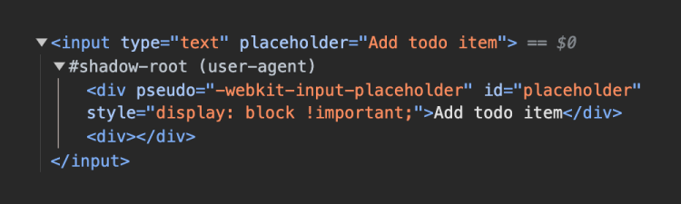
As a fun aside, there’s a way to see the internals of some built-in HTML elements via Chrome Dev Tools. Go to Settings > Preferences > Elements (section) and turn on the “Show user agent shadow DOM” setting. If you start poking around you should find some elements with user agent shadow roots. For example, here are the internals of an <input type="text"> pulled from yesterday’s todo list component!
An open shadow DOM, on the other hand, does allow for programmatic access and manipulation after it has been created via an element.shadowRoot property. Open shadow DOMs are usually what you want to use when developing web components.
Creating shadow DOM
As I mentioned yesterday, “web component” APIs are browser APIs first and foremost so, just like templates, we can use shadow DOM with more than just web components.
In this case, the specific set of HTML elements we can use include <article>, <aside>, <blockquote>, <body>, <div>, <footer>, <h1>, <h2>, <h3>, <h4>, <h5>, <h6>, <header>, <main>, <nav>, <p>, <section>, and <span>. Other elements (such as a button) cannot host a shadow DOM.
As an easy starter example, we’ll create an open shadow DOM and attach it to a div:
<div id="example"></div>

<script type="module">
	const div = document.querySelector('#example');
	div.attachShadow({ mode: 'open' });
</script>
From there you can use the shadowRoot property and regular DOM manipulation APIs to change and update the shadow DOM however you please. In this case, let’s add some pink text to the shadow DOM.
div.shadowRoot.innerHTML = `
	<style>
		p {
			color: pink;
		}
	</style>
	<p>I'm pink text inside the shadow DOM!</p>
`;
Just like the image from earlier, if you inspect this element you’ll find that it has a shadow root with a style and paragraph tag. These elements will be fully encapsulated within this shadow DOM –– the styles will not affect elements in the light DOM and vice versa.
<div id="example"></div>
<p>I'm a paragraph in the light DOM! I will not be pink.</p>
I'm a paragraph in the light DOM! I will not be pink.
Said a different way, shadow DOM is a browser-native way of creating UI with scoped styles!
Adding styles to shadow DOM programmatically
Thus far, we’ve demonstrated creating styles declaratively using a <style> tag, but it is also possible to create styles programmatically using something called “Constructable Stylesheets.”
We actually won’t have time to cover constructable stylesheets in this series, but you can read this great intro to constructable stylesheets on Google’s web developer blog to learn more about them.
Overriding shadow DOM styles
When building a web component with shadow DOM, there are three primary ways that styles within the shadow DOM can be overridden. While this can feel limiting, it offers an interesting benefit –– you as a component developer can choose (with different levels of granularity) what styles can be overridden by those who may use your component.
1. :host styles
When defining your component styles you can use the :host psuedo-class to select the shadow DOM host. In the case of a custom element, the host will refer to the custom element tag you’ve defined (i.e. my-component).
<my-component></my-component>

<script type="module">
	class MyComponent extends HTMLElement {
		constructor() {
			super();
			this.attachShadow({ mode: 'open' });
		}
		connectedCallback() {
			this.shadowRoot.innerHTML = `
				<style>
					:host {
						background: tan;
						padding: 1rem;
					}
					p {
						color: white;
						background: teal;
						padding: 1rem;
					}
				</style>
				<p>A paragraph inside my-component.</p>
			`;
		}
	}
	customElements.define('my-component', MyComponent);
</script>
If you were to open dev tools and inspect <my-component> you’d see a style declaration that looks like this:
:host {
	background: tan;
	padding: 1rem;
}
It’s possible to override these styles in the light DOM by creating a ruleset that selects my-component.
my-component {
	background: goldenrod;
}
An important note is that styles applied to my-component will not cascade into any elements within the shadow DOM. For example, changing the color will have no effect on the paragraph tag.
my-component {
	color: yellow; /* <-- This will have no affect on the shadow DOM */
}
2. ::part() psuedo-element
But what if we did want to allow for changes on elements within the shadow DOM? Well for that you can look to the ::part() psuedo-element. With this, we can explicitly expose a part (get it?) of our shadow tree for developers to style.
It starts by adding a part attribute with some name value to the element that you want to be exposed for styling. As an example, we can update the paragraph in the shadow DOM from my-component.
this.shadowRoot.innerHTML = `
	<style>
		/* ... styles ... */
	</style>
	<p part="text">A paragraph inside my-component.</p>
`;
Back in the light DOM we can now use the ::part() psuedo-element along with the name we gave to the paragraph.
my-component::part(text) {
	color: yellow; /* <-- This WILL have an affect on the shadow DOM */
}
3. CSS variables
At the most granular level of control, we can allow individual CSS properties to be overridden using CSS variables.
One of the rules of shadow DOM is that CSS variables can “pierce through” the shadow boundary. Practically speaking this means if you define component styles in shadow DOM using a CSS variable, that variable can be changed in the light DOM and it will be reflected in your component.
Going back to our my-component example, if we remove the part so the paragraph tag can no longer be restyled and now add a border-radius property with a CSS variable as a value…
this.shadowRoot.innerHTML = `
	<style>
		/* ... other styles ... */
		p {
			color: white;
			background: teal;
			padding: 1rem;
			border-radius: var(--rounded-corner);
		}
	</style>
	<p>A paragraph inside my-component.</p>
`;
…we can define a CSS variable in the light DOM that changes only that property and nothing else in the shadow DOM.
:root {
	--rounded-corner: 10px;
}
An API for your styles
One of the really interesting ways to think about this is that shadow DOM allows you to create an API for your styles.
With shadow DOM, you have fine-grained control over how your UI can be changed and adjusted. While this comes at the cost of flexibility, for some use cases like building a design system/component library, this level of control can be extremely desirable.
As I said earlier, shadow DOM is just another tool that is good for some things and not for others –– if fine-grained control of UI styles is something you’re looking for, shadow DOM is an excellent tool for that job.
Templates and shadow DOM
It’s time to start putting the pieces together to build our first JavaScript web component!
While I have thus far demonstrated using innerHTML to set the contents of shadow DOM, it is far more desirable to use templates instead. There are three ways that a template can be added to the shadow DOM.
1. Statically created templates
The first option is to statically define your template directly in HTML and get a reference to it in your custom element class. While this works perfectly well, it is often the least used method of creating a JavaScript web component because your component markup is now separated in a different place from your component behavior.
This example might look trivial, but in most real-world scenarios it’s common to separate web component behavior into a separate JavaScript file.
<name-tag></name-tag>

<template id="name-tag-template">
	<style>
		section {
			border: 2px solid rgb(95, 85, 236);
			border-bottom: solid 12px rgb(95, 85, 236);
			border-radius: 6px;
			padding: 0;
			margin: 1rem 0 0 0;
		}
		p {
			color: white;
			background: rgb(95, 85, 236, 0.5);
			padding: 10px 40px;
			margin: 0;
			font-weight: 500;
			text-align: center;
		}
		#greeting {
			color: white;
			background: rgb(95, 85, 236);
			border-radius: 3px 3px 0 0;
			font-size: 1.1rem;
		}
		#name {
			font-weight: 700;
			font-size: 1.4rem;
			padding: 20px;
		}
	</style>
	<section>
		<p id="greeting">Hello, my name is:</p>
		<p id="name">Poppy</p>
	</section>
</template>

<script type="module">
	class NameTag extends HTMLElement {
		constructor() {
			super();
			this.attachShadow({mode: 'open'});
			this.tmpl = document.querySelector('#name-tag-template');
		}
		connectedCallback() {
			this.shadowRoot.appendChild(this.tmpl.content.cloneNode(true));
		}
	}
	customElements.define('name-tag', NameTag);
</script>
2. Dynamically created templates
Dynamically creating your template at runtime is by far the most common way to see JavaScript web components built. With this method, your component markup, styles, and behavior are all co-located in the same place.
<name-tag></name-tag>

<script type="module">
	const template = document.createElement('template');
	template.innerHTML = `
		<style>
			/* ... styles ... */
		</style>
		<section>
			<p id="greeting">Hello, my name is:</p>
			<p id="name">Poppy</p>
		</section>
	`;

	class NameTag extends HTMLElement {
		constructor() {
			super();
			this.attachShadow({mode: 'open'});
			this.tmpl = document.querySelector('#name-tag-template');
		}
		connectedCallback() {
			this.shadowRoot.appendChild(this.tmpl.content.cloneNode(true));
		}
	}
	customElements.define('name-tag', NameTag);
</script>
Quick development tip
When defining markup/styles in JavaScript you typically will do so using template literals (as I’ve shown above). This unfortunately means you lose out on code editor features like syntax highlighting and autocomplete. But this can be fixed!
In editors like VS Code, there are extensions such as es6-string-html that can provide syntax highlighting support for template literals. Once installed you just need to mark the strings you want to be syntax highlighted with a comment saying “html” or “css”:
const template = /* html */ `
	<p>I will be syntax highlighted!</p>
`;
Unfortunately, I can’t show you here in this blog post because the markdown rendered I use for my website doesn’t support this functionality, but trust me it works 😉.
Another helpful setting to change in VS Code is the “Emmet: Include Languages” setting. It will enable Emmet abbreviations in languages that are not supported by default. For the sake of this discussion adding a mapping of {"javascript": "html"} will enable Emmet in JavaScript files!
3. Declarative shadow DOM
The final method of using templates and shadow DOM together is declarative shadow DOM and like the name suggests this is a fully declarative way to create a shadow DOM and attach it to a custom element –– aka no JavaScript required!
With that said declarative shadow DOM is only supported in Chrome and Safari at this moment. But fear not! Cross-browser support is genuinely and truly right around the corner.
<name-tag>
	<template shadowrootmode="open">
		<style>
			/* ... styles ... */
		</style>
		<section>
			<p id="greeting">Hello, my name is:</p>
			<p id="name">Poppy</p>
		</section>
	</template>
</name-tag>
Slots
Those with a keen eye may have noticed that the name tags in the above examples are hardcoded with the name “Poppy,” but it would be great if we could pass in any name. We can with the <slot> element.
When used in tandem with templates and shadow DOM, slots act as a way to render children within a component template.
<template>
	<style>
		/* ... styles ... */
	</style>
	<section>
		<p id="greeting">Hello, my name is:</p>
		<p id="name"><slot></slot></p>
	</section>
</template>
We can now pass in any name we want to our name-tag component and it will be rendered within the <p id="name"> element.
<name-tag>Poppy</name-tag>
<name-tag>Hawk</name-tag>
<name-tag>Arthi</name-tag>Named slots
It is also possible to have more than one slot in your template using named slots. You can do this by adding a name attribute to slot elements and a slot attribute to the content you pass into your web component.
Note: There can only be one slot without a name attribute in your template. This is called the default slot.
<template>
	<style>
		/* ... styles ... */
	</style>
	<section>
		<p id="greeting">Hello, my name is:</p>
		<p id="name"><slot></slot></p>
	</section>
	<slot name="message"></slot>
</template><name-tag>
Poppy
<p slot="message">This is a message!</p>
</name-tag>This is a message!
Styling slotted content
To wrap things up, I should also mention that you can style content that is passed into slots with the ::slotted() psuedo-element.
<template>
	<style>
		/* ... other styles ... */
		::slotted(p) {
			color: red;
		}
	</style>
	<!-- ... template markup ... -->
</template>This is a message!
In the next episode…
Hopefully, I accomplished my mission and you (dear reader) have an increased clarity and appreciation for what shadow DOM is, how it works, and why it’s special. If not, let me know what questions you still have and I’d love to try and answer them!
We’ve also officially concluded our intro to web components and now we get to have some more fun. In the next post, we’re talking about what I think is one of the most compelling (and not usually talked about) use cases for web components –– markdown.
Follow me on Mastodon for updates and see you tomorrow!
Hello, my name is:
I'm pink text inside the shadow DOM!
A paragraph inside my-component.
A paragraph inside my-component.